Bubblelines
A web and mobile-friendly application for visualizing and trading stock options with a playful, beginner-first design — reducing cognitive load so users can focus on decisions, not the interface.
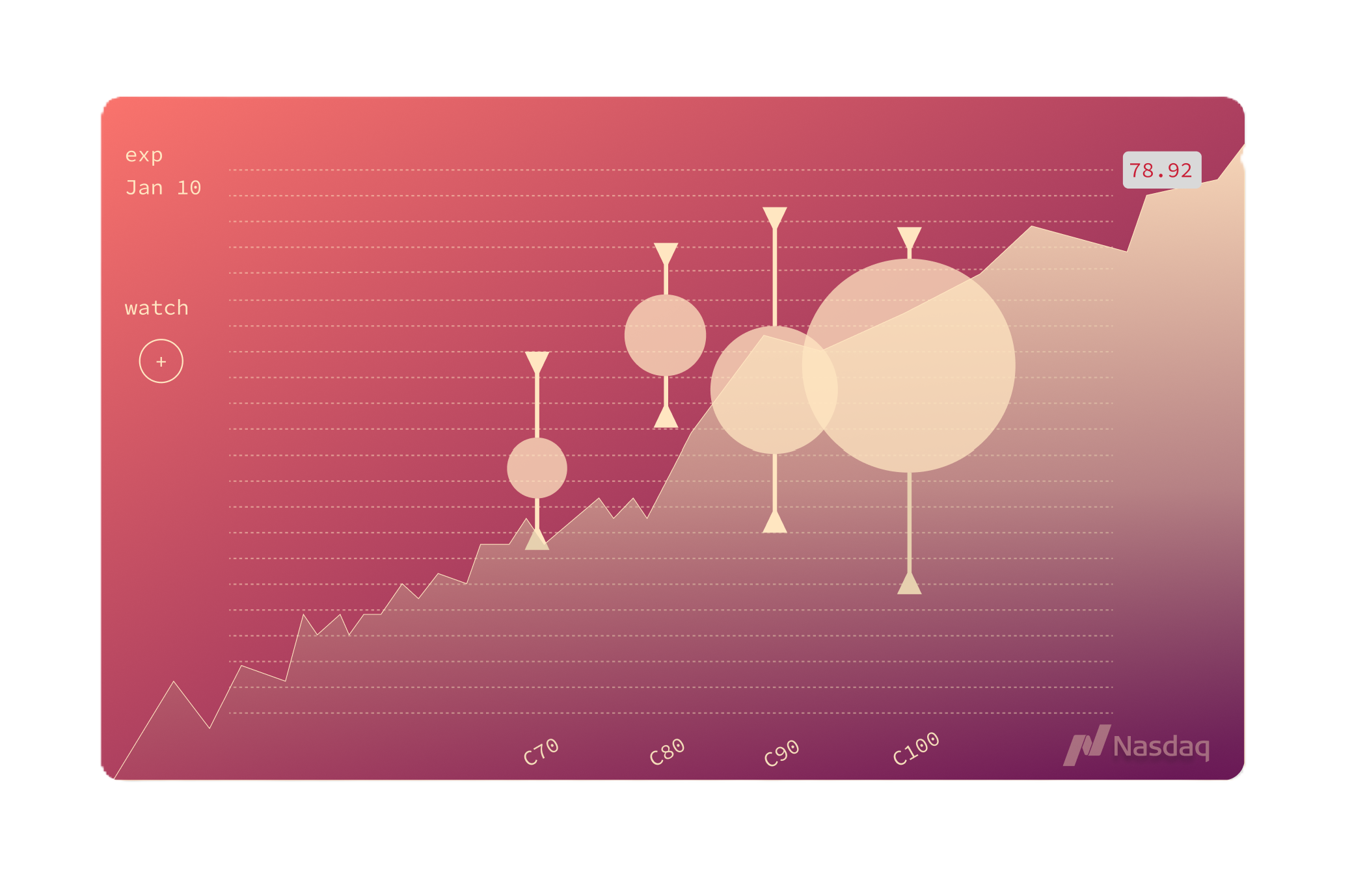
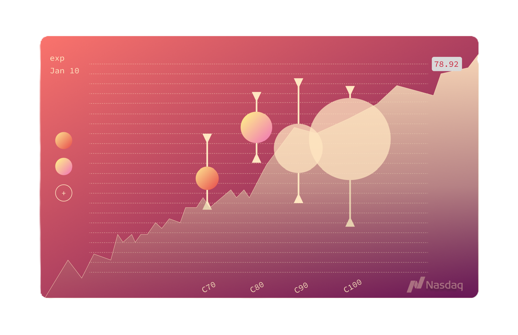
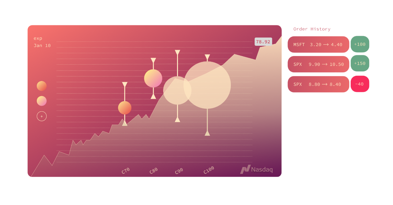
Screenshots
Problem Statement
The Problem
Stock options trading comes with significant cognitive load. Existing platforms overwhelm beginners with dense charts, cluttered dashboards, and walls of numeric data — and the very act of interacting with the interface can introduce cognitive biases whilst trading.
Users must simultaneously track multiple markers, data points, and chart types — a near-impossible task for newcomers, and a friction-heavy experience for seasoned traders who deserve a cleaner, faster workflow.
Solution
The Solution
Bubblelines is a beginner-friendly dashboard built around playful, inviting design — transforming intimidating financial data into approachable, visually intuitive charts that guide the user rather than overwhelm them.
- Simplified options visualization that communicates key data at a glance without noise.
- Playful visual design language that lowers the emotional barrier to entry for new traders.
- Streamlined dashboard layout deliberately reduces the number of simultaneous cognitive decisions.
- Real-time stock data integration via API to keep charts live and accurate.